How to Enable System Wide High Contrast Text: Smartphones are no longer just communication tools. They are our primary screens for reading messages, emails, news, social media, documents, and even work-related content. As screen time increases, so does eye strain.
Many Android users experience difficulty reading text due to low contrast, small fonts, or busy backgrounds. This problem becomes more noticeable on modern apps that rely heavily on colorful UI designs and subtle typography.
To address this issue, Android includes a powerful yet often overlooked accessibility feature known as High Contrast Text. When enabled, this feature enhances the visibility of text across the system by adding a clear outline around characters, making them easier to distinguish from their background.
It is especially useful for people with low vision, eye fatigue, or anyone who wants sharper readability without changing font size or display resolution.
In this in-depth guide, we will explain How to Enable System Wide High Contrast Text on Android, how it works, where to find it on different Android versions and brands, who should use it, its real-world benefits, limitations, and how it compares with other readability options.
The aim is not just to show steps, but to help you understand why this feature exists and how it can genuinely improve your daily Android experience.
Also Read: How to Use One Handed Mode on Android for Large Screen Phones
What Is System Wide High Contrast Text on Android
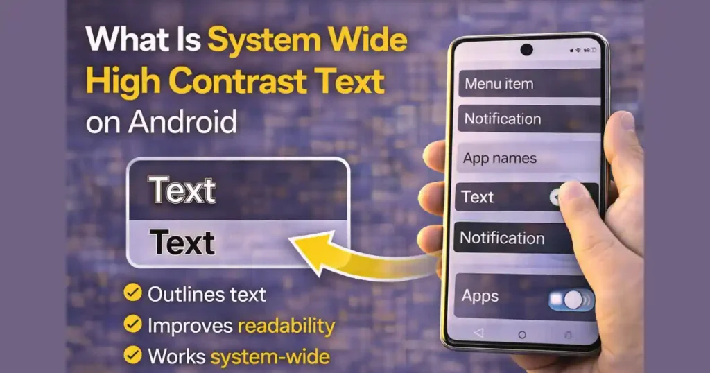
System wide high contrast text is an Android accessibility feature designed to improve text readability by increasing visual contrast between text and its background. Instead of changing colors entirely, Android adds a thin black or white outline around letters, depending on the background and theme. This outline makes text stand out more clearly, even on colorful or complex screens.
The key point here is that the feature works at a system level. That means it affects:
- System menus
- Settings pages
- Notifications
- Supported apps
- Dialog boxes
- Labels and UI text
Unlike font size or display scaling, high contrast text does not alter layout or spacing. It simply improves clarity.
Why Android Added High Contrast Text
Modern Android design focuses heavily on aesthetics. While this looks good, it sometimes sacrifices readability. Light gray text on white backgrounds, colorful wallpapers behind icons, and subtle UI elements can strain the eyes over time.
Android introduced high contrast text to solve three major problems:
- Accessibility needs
Users with low vision, partial vision loss, or color sensitivity need stronger contrast to read comfortably. - Eye fatigue from long screen time
Even users with perfect vision experience strain after hours of reading small text on bright screens. - Inconsistent app design
Not all apps follow strict accessibility guidelines, leading to poor text contrast in some interfaces.
By offering a system-level solution, Android ensures improved readability without relying on individual app developers.
Who Should Use High Contrast Text on Android

While this feature is technically part of Accessibility settings, it is not limited to users with disabilities. In real-world usage, many people benefit from it.
High contrast text is useful for:
- Users with low vision or blurred vision
- People who experience eye strain or headaches
- Seniors who find small text difficult to read
- Users who read a lot on their phone
- People using phones outdoors in bright light
- Users who prefer clarity over minimal UI design
If you often increase brightness, squint at text, or zoom in frequently, this feature is worth trying.
How High Contrast Text Actually Works
When you enable high contrast text, Android modifies how text is rendered on the screen. It adds a subtle outline around each character. The outline color adapts automatically to maintain visibility. For example:
- Light text may get a dark outline
- Dark text may get a light outline
This approach improves readability without changing:
- Font style
- Font size
- App layout
- Screen resolution
Because the effect is subtle, it doesn’t feel intrusive or visually aggressive.
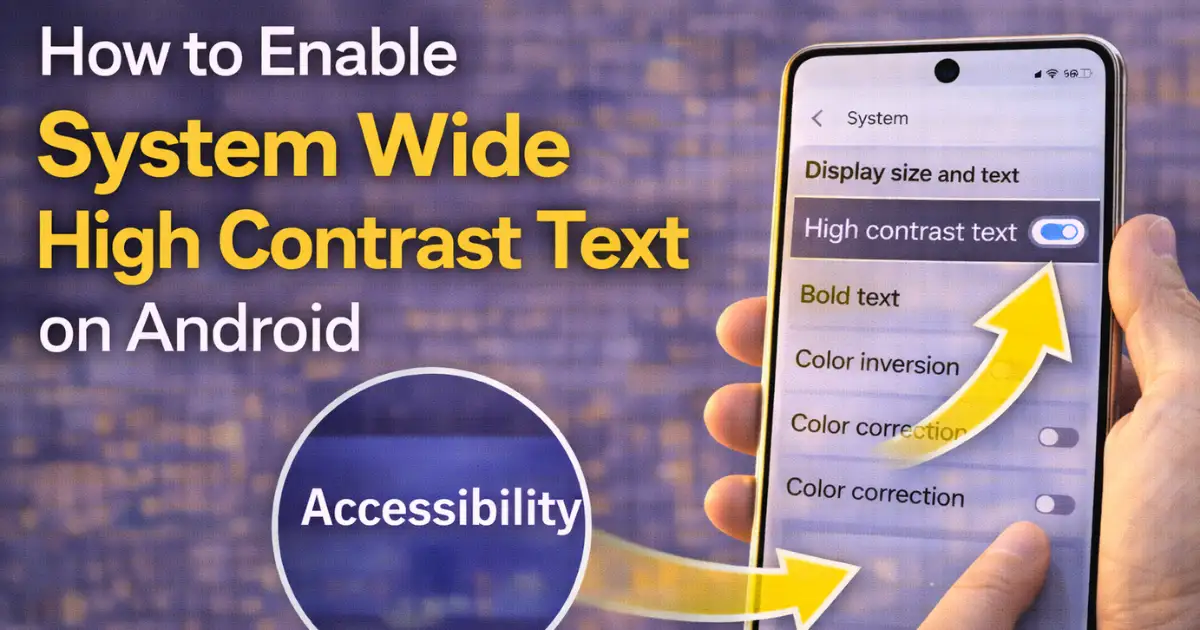
How to Enable System Wide High Contrast Text on Android (General Method)
The exact menu names may differ slightly depending on your Android version and phone brand, but the core steps remain similar.
Step-by-Step Instructions for Most Android Devices
- Open the Settings app
- Scroll down and tap Accessibility
- Look for Display, Display size and text, or similar
- Find High contrast text (or Outline text on newer versions)
- Toggle the switch On
Once enabled, the change takes effect immediately across the system.
This is the simplest and most universal way to learn How to Enable System Wide High Contrast Text on Android.
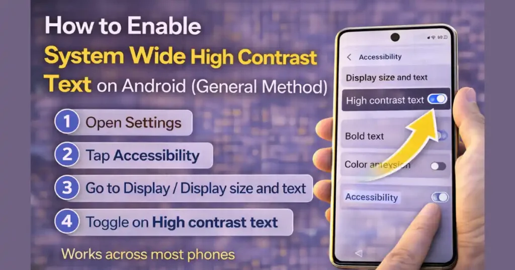
How to Enable High Contrast Text on Google Pixel and Stock Android (Android 14–16)
Google Pixel devices and stock Android phones follow a clean and consistent settings structure.
Steps
- Open Settings
- Tap Accessibility
- Select Display size and text
- Toggle High contrast text
On very recent Android versions (Android 16 and newer), the feature may be labeled Outline text, but the function remains the same.
Pixel devices usually show the effect clearly in Settings and notifications right away.
How to Enable System Wide High Contrast Text on Samsung Galaxy Phones
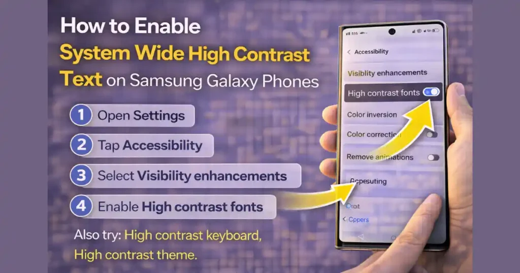
Samsung devices use a different menu structure under One UI.
Steps for Samsung Galaxy
- Open Settings
- Tap Accessibility
- Select Visibility enhancements
- Enable High contrast fonts
Samsung also offers additional options in this menu, such as:
- High contrast keyboard
- High contrast theme
- Custom visibility adjustments
This gives Samsung users more flexibility in improving readability beyond just text outlines.
How to Enable High Contrast Text on Other Android Brands
OnePlus
- Settings > System > Accessibility
- Enable High contrast text
Realme (UI 3.0 and newer)
- Settings > Accessibility > Vision
- Enable High contrast text
Other Brands
Most manufacturers place this option under Accessibility > Display-related settings. The naming may vary slightly, but the function remains consistent.
What Changes After You Enable High Contrast Text
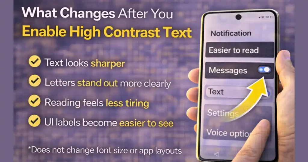
Once enabled, you may notice:
- Text looks sharper
- Letters stand out more clearly
- Reading feels less tiring
- UI labels become easier to distinguish
- Notifications are clearer
The feature does not:
- Increase font size
- Change app colors
- Affect wallpapers
- Slow down performance
This makes it safe to use even on older devices.
System Wide vs App-Level Support: What to Expect
High contrast text is designed to work system-wide, but results can vary depending on app support.
Works Well In
- Android Settings
- Google apps
- System dialogs
- Notifications
- Most modern apps
May Be Limited In
- Poorly designed third-party apps
- Games with custom UI rendering
- Older apps not updated for accessibility standards
This limitation is due to app-level design, not a flaw in the feature itself.
High Contrast Text vs Other Readability Features
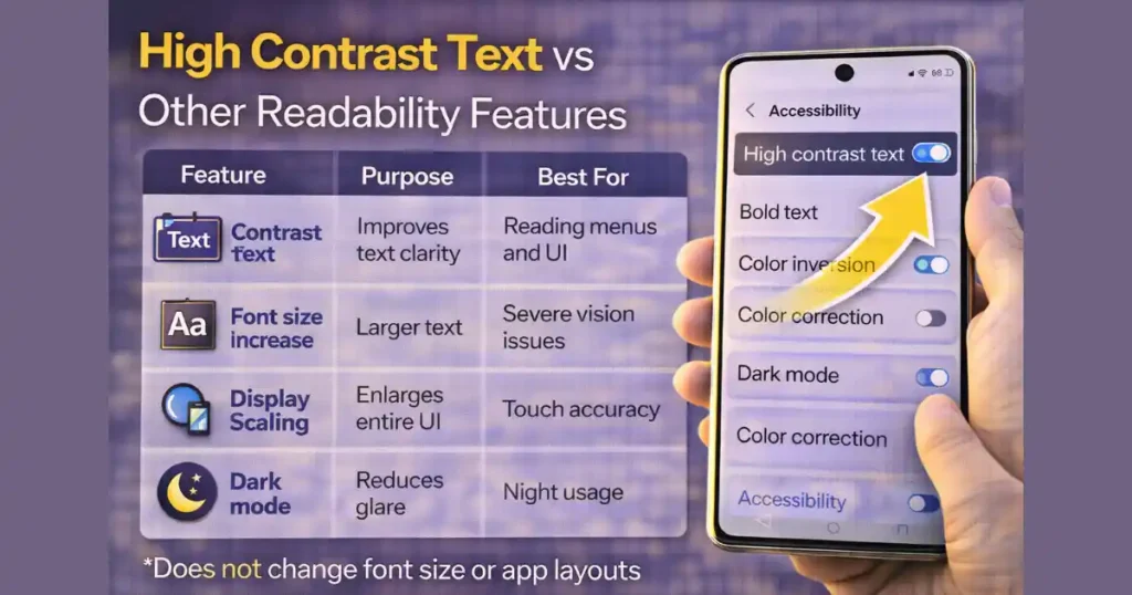
| Feature | Purpose | Best For |
|---|---|---|
| High Contrast Text | Improves text clarity | Reading menus and UI |
| Font Size Increase | Larger text | Severe vision issues |
| Display Scaling | Enlarges entire UI | Touch accuracy |
| Dark Mode | Reduces glare | Night usage |
| Color Correction | Color vision support | Color blindness |
High contrast text complements these features rather than replacing them.
Why High Contrast Text Is Better Than Just Increasing Font Size
Many users increase font size to improve readability. While helpful, it can cause:
- Layout issues
- Text wrapping problems
- Reduced on-screen content
High contrast text improves clarity without changing layout, making it a cleaner solution for many users.
Also Read: How to Create App Shortcuts on Android Home Screen for Quick Tasks
Common Use Cases in Daily Life
High contrast text proves useful in real scenarios:
- Reading notifications quickly
- Navigating settings without zooming
- Using apps outdoors
- Reading messages in bright environments
- Reducing eye fatigue during long usage sessions
It’s especially effective when combined with moderate brightness and dark mode.
Limitations You Should Be Aware Of
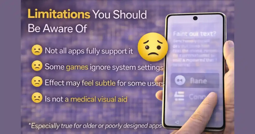
While helpful, high contrast text has a few limitations:
- Not all apps fully support it
- Some text-heavy games ignore system settings
- Visual effect may feel subtle for some users
- Does not replace medical visual aids
Still, for a built-in feature, its benefits outweigh its limitations.
Tips to Get the Best Results
- Combine high contrast text with dark mode
- Keep font size at a comfortable level
- Avoid overly colorful wallpapers
- Adjust brightness based on lighting conditions
- Test the feature for a full day before deciding
Small adjustments make a noticeable difference.
FAQs: How to Enable System Wide High Contrast Text
1. Does high contrast text affect battery life?
No. It only changes text rendering and has no measurable impact on battery consumption.
2. Will high contrast text work in all apps?
Most apps support it, but some third-party apps may not fully apply the effect.
3. Is high contrast text only for people with vision problems?
No. Anyone who wants clearer text and less eye strain can benefit.
4. Can I turn it off anytime?
Yes. You can disable it instantly from Accessibility settings.
5. Is this feature available on all Android phones?
Most modern Android devices support it, though menu names may vary.
Conclusion
As smartphones continue to dominate daily life, readability matters more than ever. Android’s high contrast text feature is a simple yet powerful tool that improves clarity without changing how your phone looks or behaves.
Once you understand How to Enable System Wide High Contrast Text on Android, it becomes an easy upgrade to your daily experience. Whether you’re protecting your eyes, improving accessibility, or just making text easier to read, this feature quietly delivers real value.
Disclaimer: Feature availability and menu names may vary depending on Android version, device manufacturer, and software updates.
Also Read: How to Use WiFi Sharing via QR on Android Without Third-Party Apps

Raj Prajapati is a skilled content writer dedicated to creating clear, step-by-step guides on technology, Health, and everyday solutions. With a focus on user-friendly and SEO-optimized content, he simplifies complex topics, helping readers learn and solve problems effortlessly.